Performance Report: 02/28/2023
All performance data for our strategies is net of all fees and expenses. All performance data for indexes or other securities is from sources we believe to be reliable. All data is as of 2/28/2023.
Investment Strategy
MAP: Full ($500k+)
MAP: Mini
MAP: ETP (<150k)
S&P 500 Index2
Balanced (AOM)2
Global Balanced2
Feb. Return
(3.6%)
(3.9%)
(4.3%)
(2.6%)
(2.8%)
(2.8%)
YTD
(1.5%)
(1.8%)
(2.4%)
3.4%
3.0%
2.8%
Inception1
27.2%
24.6%
20.6%
37.8%
10.3%
16.3%
VORR3
.712
.642
.515
.384
.224
.182
Administrative note: Previously, I have tracked performance by averaging the returns across all program accounts participating in our managed strategy as our exposure was fairly standardized prior to 2022. But as I integrate more derivative (1256) contracts into our strategy, exposure will vary depending on account size. For this reason, I will report performance based on various bands which are determined by account size.
On paper, February was a tough month for us. And typically, losses just eat at me. And while our performance in February does not sit well with me, it has not dissuaded me from the direction we are taking. In fact, my resolve has strengthened as it is becoming increasingly clear what is about to transpire in the capital markets. By looking at the numbers, it's hard to see, but by living with the markets every day, the picture is coming into focus.
I picked a less-than-ideal time to increase our exposure to real assets. But as I said in my thesis, "I suspect I am early and I can't dictate the exact timing, but to get the best seats for the show, we have to show up early." I was early getting out of the stock market in 2021 and I knew full well that I would probably be early further increasing our allocation toward commodity-related themes. But I'm confident in the course I'm taking and, at some point, my approach will pay strong dividends.
Without going into a great amount of detail, here is what I'm seeing. A host of commodities have been trading sideways for some time. In Wall Street vernacular, one would describe the price action in these securities as "rangebound". A great majority of the time, when a security is trading sideways or "rangebound" for a considerable time, the subsequent move can be quite large, either up or down. Yes, some securities in the MAP system may move down, but our stops will continue to get us out of these trades if they move against us. Conversely, if the move is higher, the MAP is doing a good job of identifying attractive points of entry.
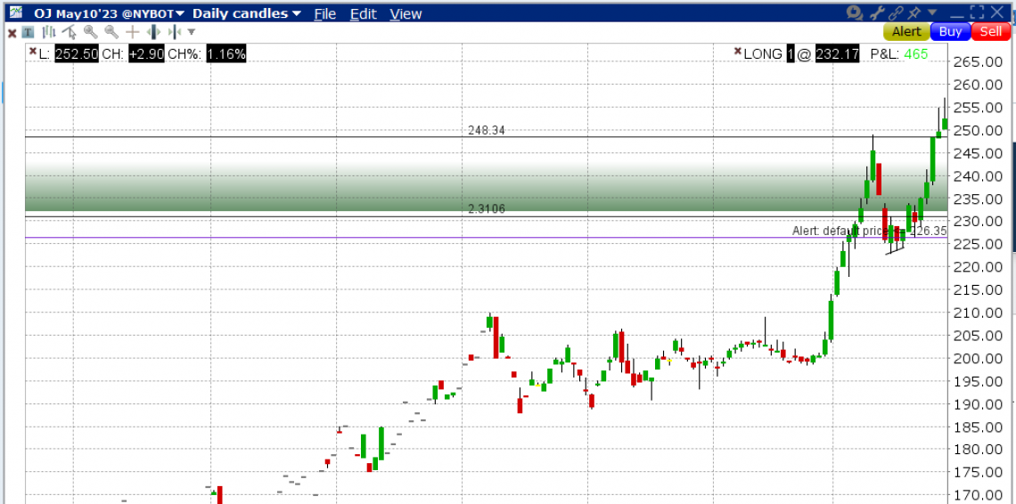
Two securities that have recently met the "rangebound" criteria and have subsequently gone up significantly are orange juice (OJ) and sugar (SB). I'll illustrate orange juice given it was a focal point of my thesis.

As you can see, OJ traded sideways for three months. Upon completing its rangebound trading, it popped 25% in just one month. Our primary sugar position which traded sideways for a few months as well has now appreciated just over 10% in a couple of months. This is not surprising to me at all, as I said above, securities tend to experience large price moves following a period of rangebound trading. Throughout my career, some of my most profitable positions have been a result of seeing this exact phenomenon.
(Fortunately, for my larger clients, we bought OJ prior to the big move higher. Unfortunately, due to the size of the contract, I could not buy it for my moderate-sized clients. All my clients have sugar in various forms and the returns on sugar have been solid as well.)
Currently, over half the commodities I have in the MAP system are experiencing "rangebound" trading which will eventually be resolved in a large price move in one direction or the other. If the price action breaks higher in any of these, prices could surge. The OJ example is a bit of an outlier but given what I wrote in my thesis, it could well be the new normal in 2023. When these commodities breakout of their rangebound trading, assuming the price is moving higher, we should have some exposure and hopefully participate in the gains in a meaningful way.
For full disclosure, there are some commodities that are trending versus moving sideways. Trending simply means they are moving up or down, and in the case of February, some trended down in quite a remarkable way. And this led to losses for us this past month. Natural gas was the worst case which was down over 30% in February alone and down over 80% from its peak of last year. Precious metals also took a hit with gold declining over 5% and silver falling over 10%.
In order to capture the upside volatility that I know will take place in some of our positions, we will have to endure some downside volatility. This month was down but not nearly as down as it could have been. My stop-loss discipline limited losses. Nearly all our losses were in natural gas with the balance of the strategy being flat.
Market Update
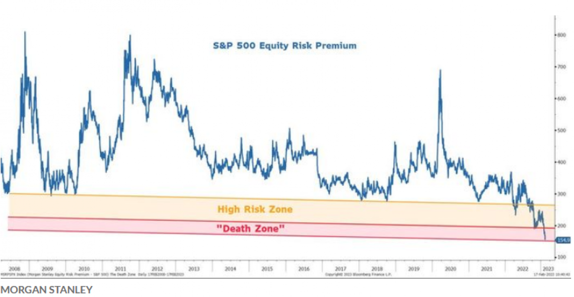
While the last few months have provided a brief reprieve for US equity investors, the long-term outlook continues to look dour. This month, a story has been circulating through the financial media that focuses on the "S&P 500 Equity Risk Premium". The following chart provided by some analysts at Morgan Stanley illustrates how the S&P 500 is currently in the "Death Zone" as its future projected returns are at or below the risk-free rate of US Treasuries.

Essentially, this chart is suggesting that while equities may have higher returns than US Treasuries, the increased risk of owning stocks does not merit an investment in them. I have addressed this issue in the past but referred to it in the context of Dow Theory. The idea is the exact same, Morgan Stanley has just given it a different name. In short, the expectation of future equity returns needs to be priced relative to the long-term, relatively risk-free rate of US Treasuries. As treasury yields go higher, the future expected return for the S&P 500 must go higher as well. And the most conceivable means to increase future expected returns for the S&P 500 is for valuations to fall. And the most conceivable means for valuations to fall is for stock prices to fall. Some models have stock prices falling in quite a remarkable way. Dr. John Hussman, an incredibly bright yet consistently bearish analyst, is calling for equities to fall by as much as 60%.
I contend that this analysis is only considering half the story when it comes to what drives equity returns. The primary driver of long-term equity market returns is valuations, which is what these analysts are focusing on. The second driver is liquidity. The "Equity Risk Premium" story only considers the valuation story and not the liquidity variable. And for the past decade, liquidy has been driving equity prices higher. The "moon-shot" experienced by equity indexes starting in late March of 2000 through December of 2021 was wholly a function of liquidity. Today, some liquidity is moving out of US equities but it is not going far as it's finding its way into domestic bonds. Total liquidity is, at this juncture, not being threatened. God forbid, if something happens to the liquidity variable and US capital markets experience a net outflow of capital, there could be quite a reckoning. This would cause interest rates to climb even higher while equity indexes would be forced much lower.
A story on CBSMarketwatch this month attests to the fact that liquidity is far from drying up. The story is titled, "The secret to stocks' success so far in 2023? An unexpected $1 trillion liquidity boost by central banks." Obviously, $1T is a big number. And that big number has served to alleviate any selling pressure equity indexes had been subject to. So while valuations are obscenely high, especially relative to the return on US Treasuries, the real danger to US equity markets is a reduction in the liquidity being shoveled into the capital markets. If my thesis is correct and some of this liquidity is being used to influence hard asset prices, then any reduction in liquidity would expedite our gains.
Conclusion
CNBC quoted Greenlight Capital's founder, David Einhorn, one of our nation's most successful hedge fund managers, as saying, "I think we should be bearish on stocks and bullish on inflation." And that is preciously where we are positioned. Other legendary investors such as Jim Rogers and Marc Faber have echoed this sentiment.
But "just because something is inevitable, doesn't mean it's imminent." The timing of the developments I addressed in my thesis is the one wildcard I do not know. I'll continue positioning our portfolio in assets that will benefit from inflation. But I also know there are nefarious forces on Wall Street and inside our central bank that will continue to fight inflation using illicit means which I have addressed. We are investing against their efforts and thus we should expect setbacks, as happened this past month. By continuing to use my risk-management techniques, I should be able to protect us from any unrecoverable losses and, at the same time, be properly positioned when my thesis comes to fruition.
I realize that "enduring downside volatility in order to capture the upside volatility" will be harrowing for us all and perhaps untenable for some. I am staying the course but if you want me to make adjustments to your account, please let me know.
As always, please do not hesitate to call me at 512-553-5151 if I can be of assistance.
Best,
Matt McCracken
1) Inception date of 4/30/2019
2) All benchmark prices are obtained through the Yahoo!Finance website. S&P 500 Index is calculated using the index price. AOM is the iShares Core Moderate Allocation ETF. Global Balanced is calculated using a 40% allocation to the S&P 500, a 40% allocation to BND and a 20% allocation to IEFA.
3) VORR is our "Value over Risk Ratio": Calculated by taking the total return divided by the sum total of all negative months. Ideally, the ratio represents how much loss does an investor have to endure to get X gain. A negative RORR score implies there is more risk in the investment than return.
